Brand identity is the cornerstone of how a business presents itself to the world. It shapes perceptions, influences decisions, and sets a company apart in a crowded marketplace. A strong brand builds trust, fosters loyalty, and transforms isolated products or services into meaningful experiences. In the B2B sphere, effective branding creates lasting connections with clients and drives long-term success.
In short, a turquoise platypus will always just be an ordinary platypus. But a turquoise platypus with a fedora? PERRY THE PLATYPUS?!

If it weren’t for the coffee, I’d have no identifiable personality whatsoever. – David Letterman
Every Little Bird branding project begins with comprehensive research. We delve into your industry, audience, and competitors to uncover the full spectrum of your brand. Through inspiration boards, conceptual planning, and collaborative brainstorming, we explore color, theme, typography, texture, pattern, key messaging, and desired client experience.
With a solid strategic foundation, our creative team brings your brand to life. We sketch, design, and refine until we’ve created a comprehensive brand identity – including logo, color palette, typography, and distinctive visual elements that will represent your business effectively for years to come.
Upon completion, we provide a comprehensive digital package containing all your branding files, enabling seamless implementation across various platforms. We also offer guidance on sourcing branded materials such as business cards or signage, ensuring consistent application of your new identity.
We’re ready to hear from you.
Multilingual Connections, a human-powered and tech-driven global language partner, approached us with a challenge: to elevate their B2B brand design to match their dynamic, future-focused approach to translation and localization services. Specializing in culturally nuanced translation, transcription, transcreation, and multimedia localization for organizations seeking to understand, engage, and grow multilingual audiences, they needed a brand that could speak volumes across cultures in the B2B space.
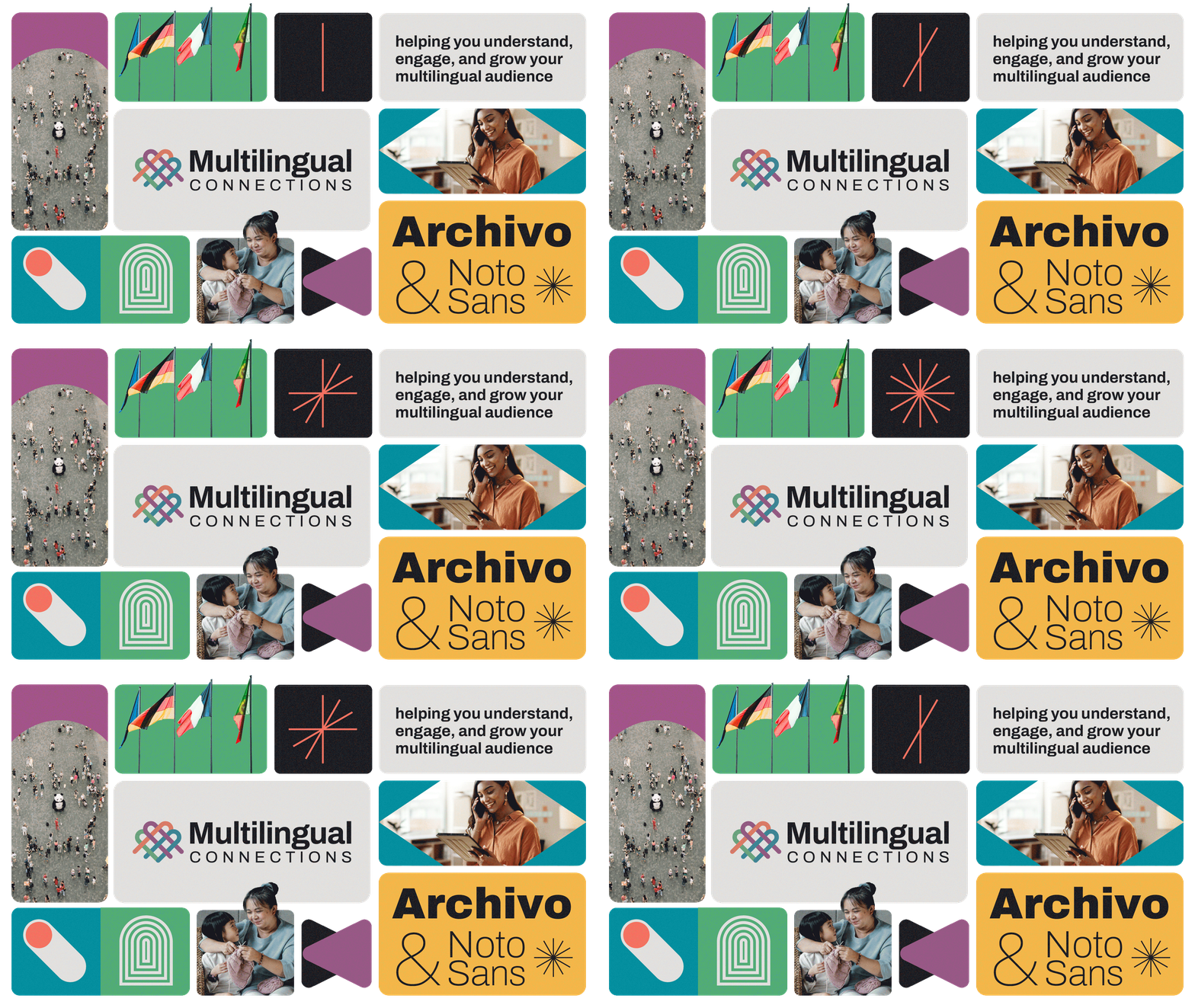
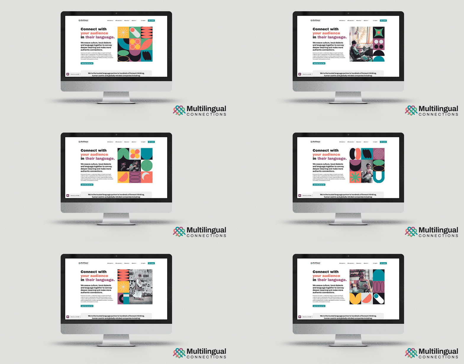
Building upon the strategic foundation laid by our proprietary SOAR™ system, which had already guided their persona development and tone of voice, we crafted a comprehensive brand identity that centers on a versatile system of geometric patterns. These modular squares house distinctive shapes that can be used individually or combined to create dynamic compositions. This flexible design system became the foundation for a comprehensive set of service-specific icons, creating a visual language as nuanced as the translations they provide.
The centerpiece of this system is a logo that subtly weaves together strands of different colors, symbolizing the interconnectivity of global cultures. Supporting this, we developed a palindromic color palette where each vibrant hue finds its counterpart, mirroring the transformation of meaning across languages. The identity also features a thoughtfully curated typographic system that marries modernity (Archivo) with universal accessibility (Noto Sans).
The identity extends to a thoughtfully curated photographic style that captures authentic moments of connection, focusing on individuals and small groups engaged in meaningful interaction. To fully express the breadth of global communication, we developed dynamic treatments that seamlessly blend photography with our geometric patterns, creating a fluid visual narrative that adapts across digital and print media.
This comprehensive B2B brand design positions Multilingual Connections as a forward-thinking leader in language services, appealing to organizations seeking to understand, engage, and grow multilingual audiences through authentic, culturally nuanced communication.
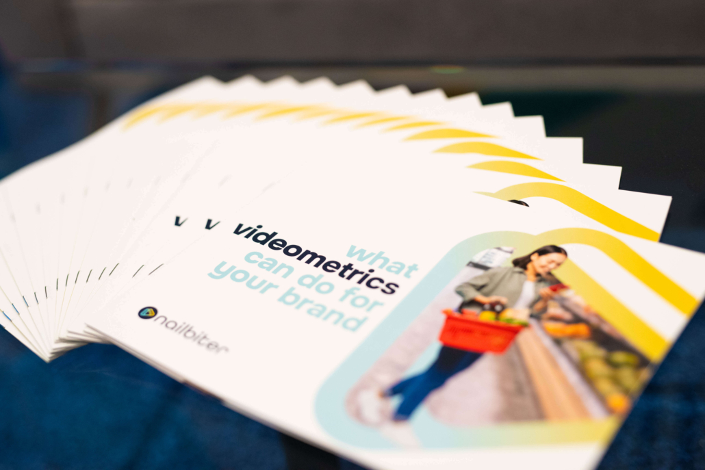
Nailbiter, a pioneering market research firm specializing in videometrics, approached us to refine their B2B brand design. Their unique platform allows clients to see and hear consumers making real-time decisions across various shopping environments. Our challenge was to create a brand identity that communicated this innovative approach while positioning Nailbiter as a trusted solution for winning brands.
Our comprehensive B2B brand design process began with in-depth interviews with the Nailbiter team, uncovering their core value proposition: the ability to capture hundreds of thousands of behavioral data points from real, in-the-moment shopping experiences. This insight formed the foundation of our brand strategy.
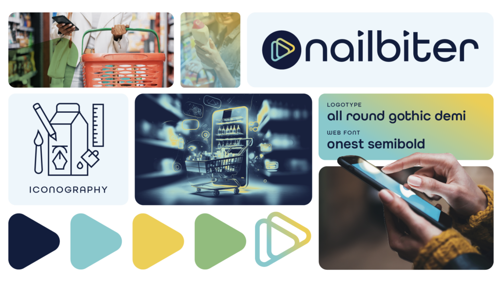
The resulting flexible design system centers around a logo featuring a soft triangle play button, nodding to their video-based methodology while maintaining approachability. We paired this with rounded typography and a vibrant yet professional color scheme, reflecting Nailbiter’s tech-forward approach. Custom iconography representing key applications like in-store shopping, e-commerce, and product usage enhances visual communication across marketing materials.
The new verbal identity positions Nailbiter as smart, provocative, and impact-focused experts, engaging potential clients with phrases like “Dive deep, don’t just scratch the surface at Nailbiter.” This comprehensive B2B brand design sets Nailbiter apart in the competitive landscape of market research, appealing to manufacturers and researchers seeking to understand consumer decisions at scale.